Tsubaki Travels
TO DESIGN A CURATED MOBILE TRAVEL EXPERIENCE THAT HELPS TRAVELLERS PLAN, BOOK, AND ORGANIZE A TRIP TO JAPAN THROUGH GUIDED DISCOVERY.
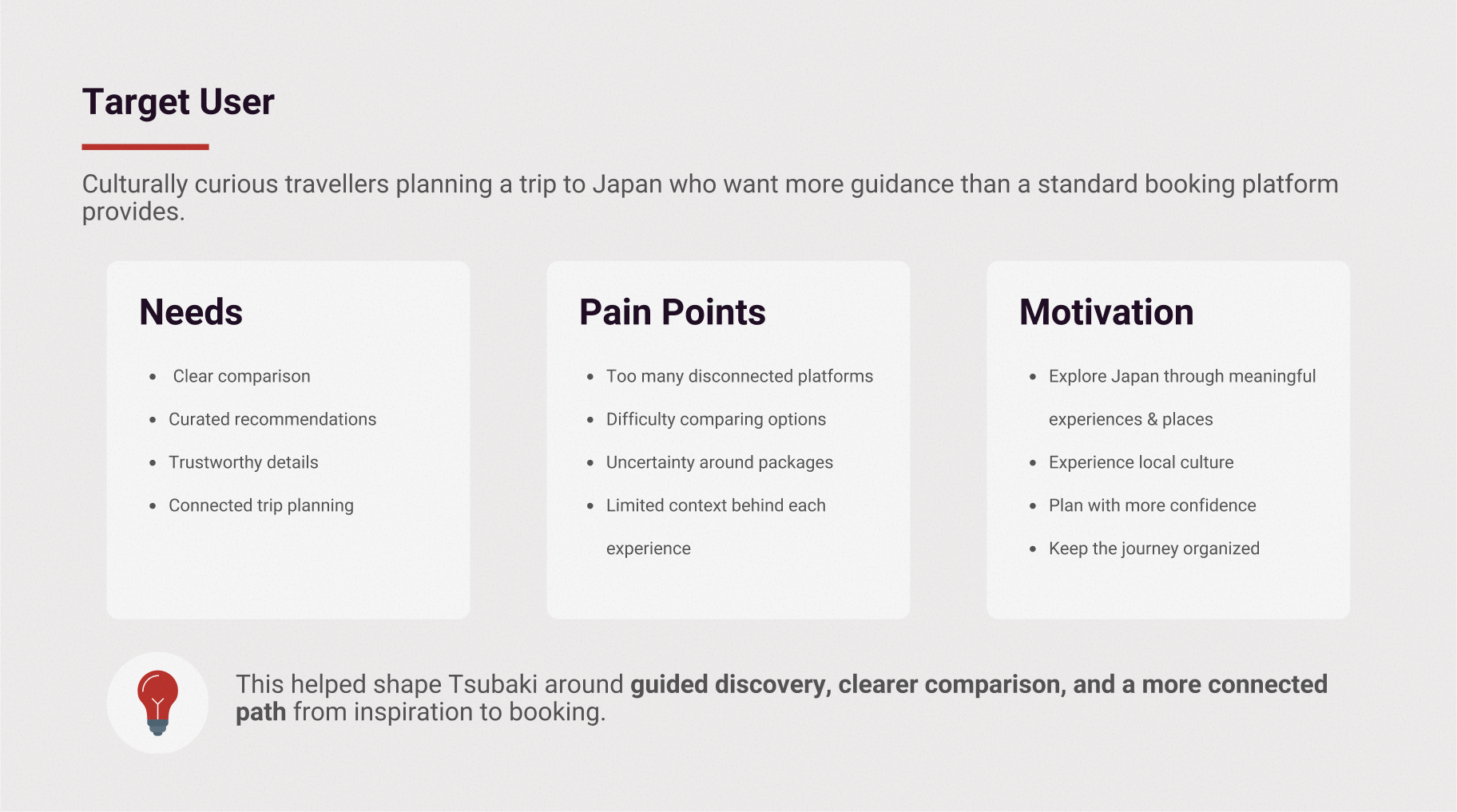
Travellers planning a trip to Japan often move between multiple platforms to compare accommodations, tours, transportation, maps, reviews, and saved recommendations. This creates a fragmented planning experience where important decisions are spread across disconnected tools.
Many booking platforms help users find availability, prices, and ratings, but provide limited support for understanding the character or context of an experience. For a culturally rich destination like Japan, this can make discovery feel transactional rather than meaningful.
As the planning process becomes more complex, travellers need a clearer way to move from inspiration to booking. Without a guided flow, users may feel overwhelmed by too many choices and struggle to keep their trip organized.

To understand the travel planning experience, I looked at how existing platforms support discovery, comparison, and booking. The research focused on identifying where mainstream travel apps work well, where the experience becomes fragmented, and how a more curated product could support travellers exploring Japan.


Users move through multiple layers of planning, from inspiration and destination discovery to accommodations, activities, transportation, and booking. Connecting these moments into one flow creates a clearer and more manageable planning experience.
Curated recommendations can make the experience feel more intentional, but users need clear details, transparent options, and a guided path before they feel confident enough to commit.
Travel platforms often present users with many options, but limited direction. For Tsubaki, the opportunity was to make browsing feel more focused through clearer categories, stronger visual hierarchy, and curated content.
Tsubaki was designed as a guided travel planning experience that connects discovery, comparison, booking, and trip organization in one mobile flow.The solution focuses on three core shifts: moving from endless search to curated discovery, from scattered information to clearer comparison, and from isolated booking steps to a connected planning journey.
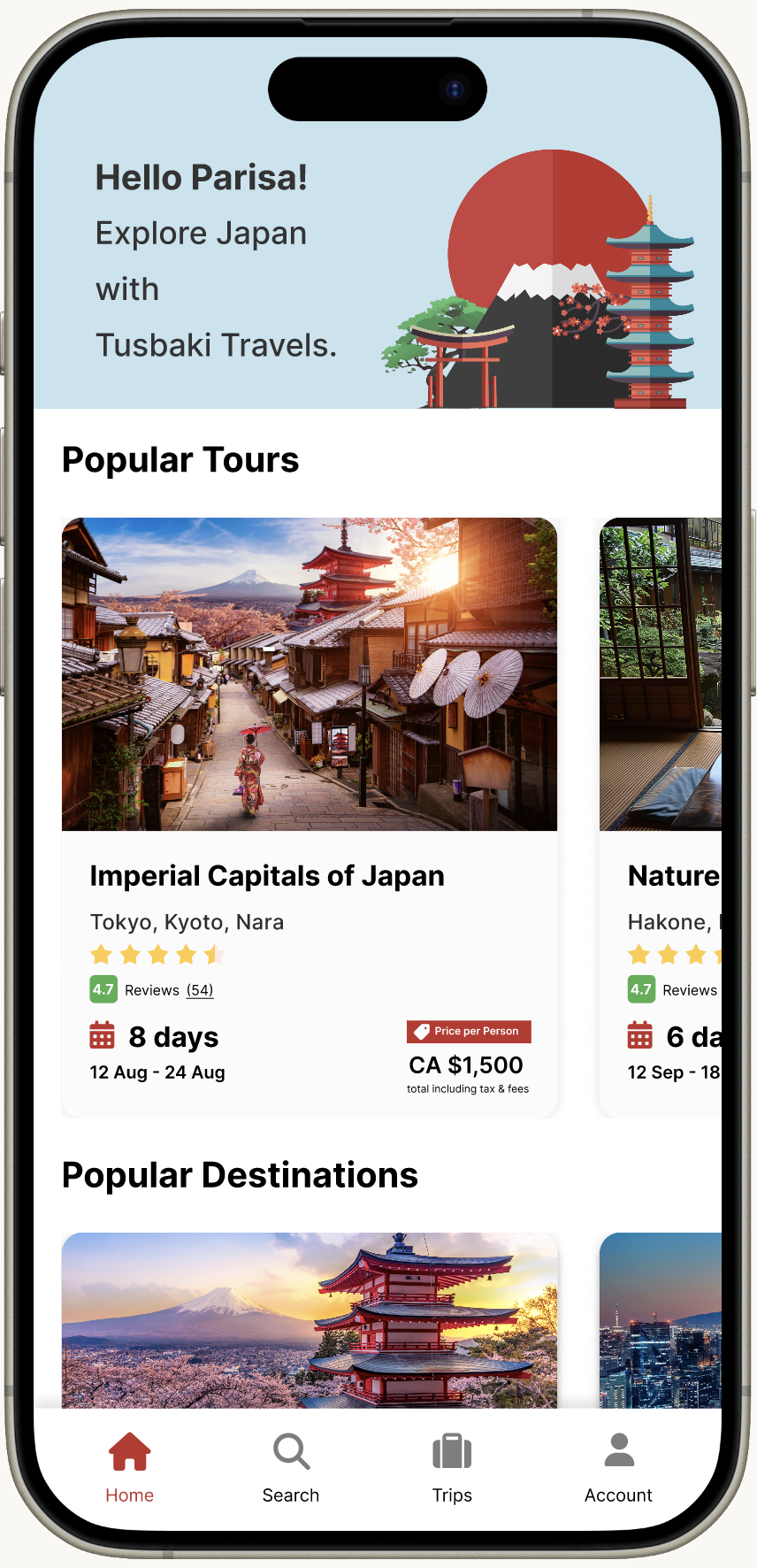
The homepage introduces selected tours, destinations, accommodations, and one-day activities, giving users a focused starting point instead of an open-ended search experience.
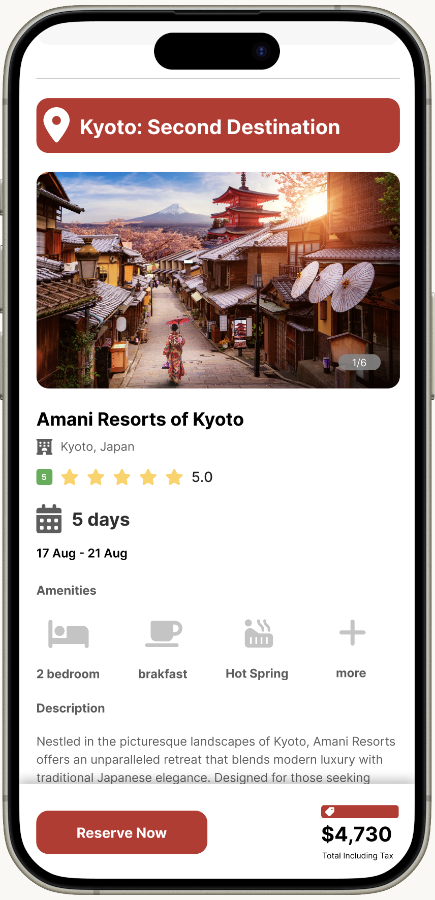
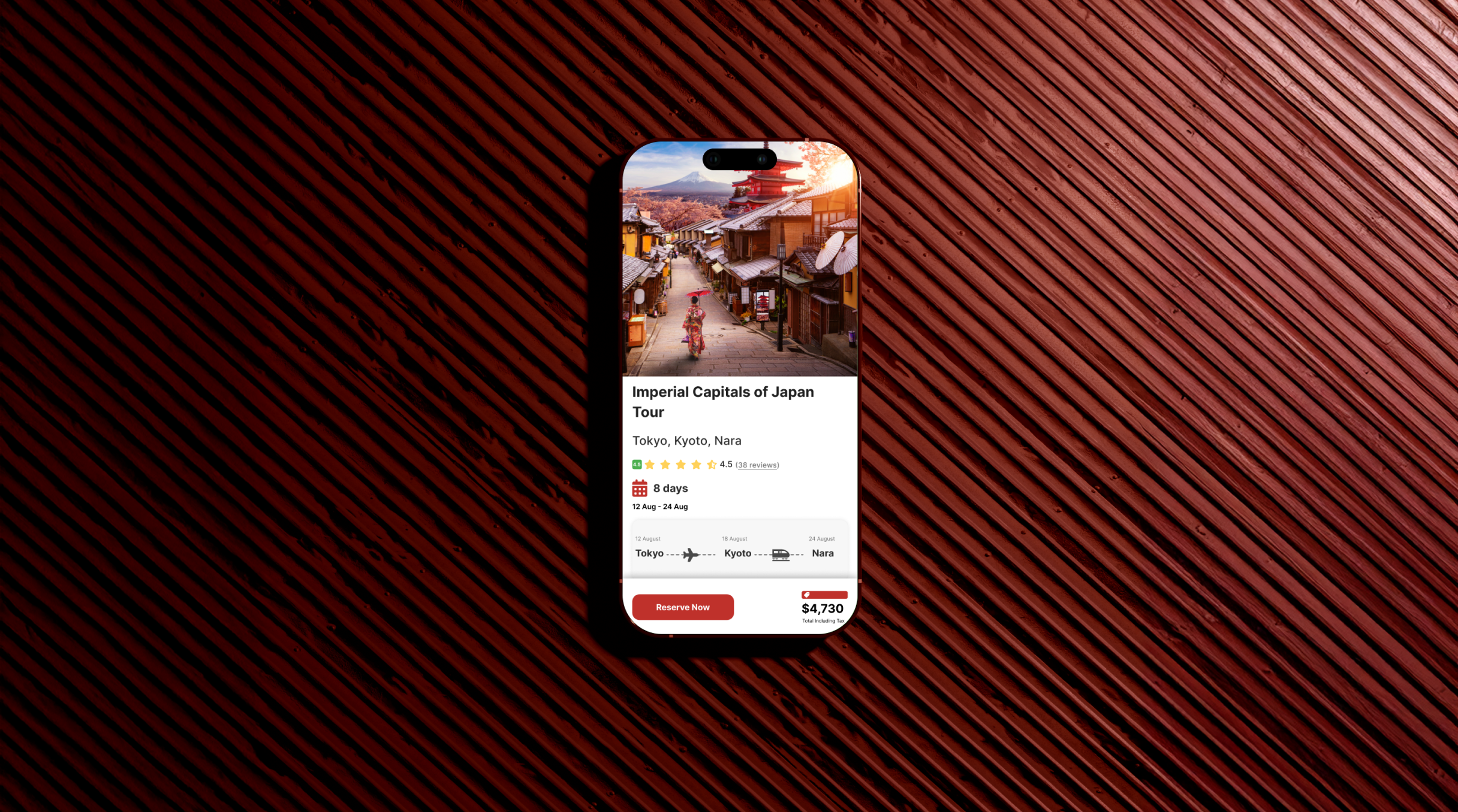
Listing and detail screens organize key information such as location, ratings, duration, price, and experience type, helping users compare options without relying only on endless browsing.
The booking flow connects detail review, payment, confirmation, and trip management, creating a clearer path from discovery to action.

The final interface brings together destination discovery, curated recommendations, booking details, payment, confirmation, and trip management in one mobile experience. The design uses a warm visual system, illustration, and image-led layouts to create a travel experience that feels guided, approachable, and culturally inspired.

The outcome is a high-fidelity mobile app concept that translates the research direction into a connected travel planning flow. Tsubaki combines UX structure, booking patterns, visual identity, and destination-led storytelling to support a more guided way of exploring Japan.
Tsubaki helped me understand how visual storytelling and UX structure need to work together in a product experience. A travel app has to create inspiration, but it also has to help users make decisions, compare options, and move through practical tasks with confidence.
One of the main lessons from this project was the importance of balancing atmosphere with clarity. Strong visuals can make the experience more memorable, but the structure underneath needs to stay simple, familiar, and easy to navigate.
If I continued developing this project, I would focus on usability testing, refining the comparison flow, expanding the component system, and adding more states for filters, saved trips, booking details, and itinerary planning.
